I'm not talking about bugs here, I'm talking about elements consciously implemented by developers (of software, appliances, packaging, etc.) that cause frustration and confusion.
1. Strikethrough-Eye Password Toggle
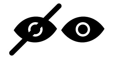 With respect to function and state, this pair of icons is basically a paradox. I mean, does a struckthrough eye mean you can't see the password or you can? Does pressing on a struckthrough eye hide it or show it? Apparently half of people would answer one way and half the other, which is why it is implemented consistently 50% of the time; and everyone is correct in their interpretation. Give me a simple Show/Hide toggle please, for from it − by comparison − function and state are pleasingly obvious.
 2. Dynamic Button Menus
Nothing creates a nicer user experience than a button that runs away (or disappears) when you are trying to press it.
If you have put a menu with dynamic buttons into your app/website, you have implemented the Whac-A-Mole pattern, which is inadvisable. A more impressive pattern by far is the alphabetized grid or list of pressable buttons, which greatly increases menu predictability and navigability.

3. Impatient Micromanagers
I had an appliance one time that − just after you had entered the cook time − would flash PRESS then START at you in quick succession for only a few seconds (maybe 10 or 15) and then just reset to display the clock. I mean, what's the rush? Apparently this appliance needed to get on with whatever it was doing, because it sure wasn't gonna wait around to cook the food.
I get a similar feeling of being rushed and micromanaged from those registration / login form fields that tell you YOU'RE DOING IT WRONG! right out of the gate...
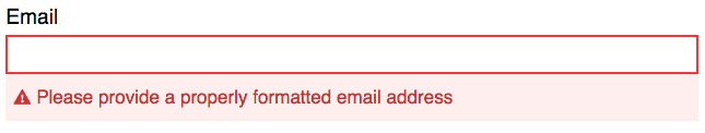
Um... I haven't even begun typing yet, how can I be so wrong already?
I'm all for ensuring properly formatted data is entered into forms, but at least wait until I've left the field to analyze what I've typed [cf. onfocusout].
4. Tear-Here Packaging
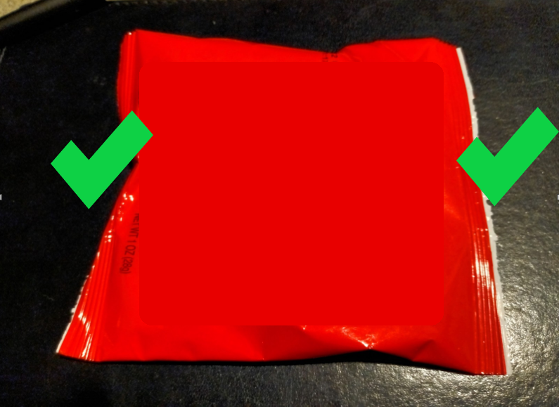
Used to be you could open any bag on the top or bottom with a 200% chance of success:
With tear-here packaging you have a mere 10% chance:
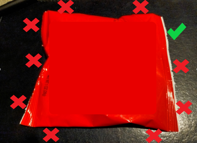
Sometimes they print on the bag to tell you where to tear, so you have to scan the bag for something legible before even attempting to open it. Sometimes they don't print anything or print it in microlettering. Good luck...
5. Movement Beside Text

Is it easy to read this text with that tornado bearing down on you?
Moving elements next to text (be they autoplay videos, GIFs, or JS animations) steal your attention away from the words you're trying to read.
* * *
Well that's it for my top five most frustrating or confusing elements of the user experience.
Here are some runners up:
- modern/minimalist info-free websites
- indecipherable icons w/o mouseover hints
- asynchronous ads force page back to top
- default text size like fine print
- indecipherable icons w/o mouseover hints
- asynchronous ads force page back to top
- default text size like fine print


